MR PORTER
Testing, learning, shipping and optimising at scale.
Optimisation & Experimentation
Optimisation sits at the heart of understanding how well our UI components perform, and how effectively elements work together in context. Working closely with the Experimentation Manager, I ran approximately eight A/B tests per month across native apps and web. The data informs every decision, ensuring what we release is measurably better than what came before.
PDP experiments
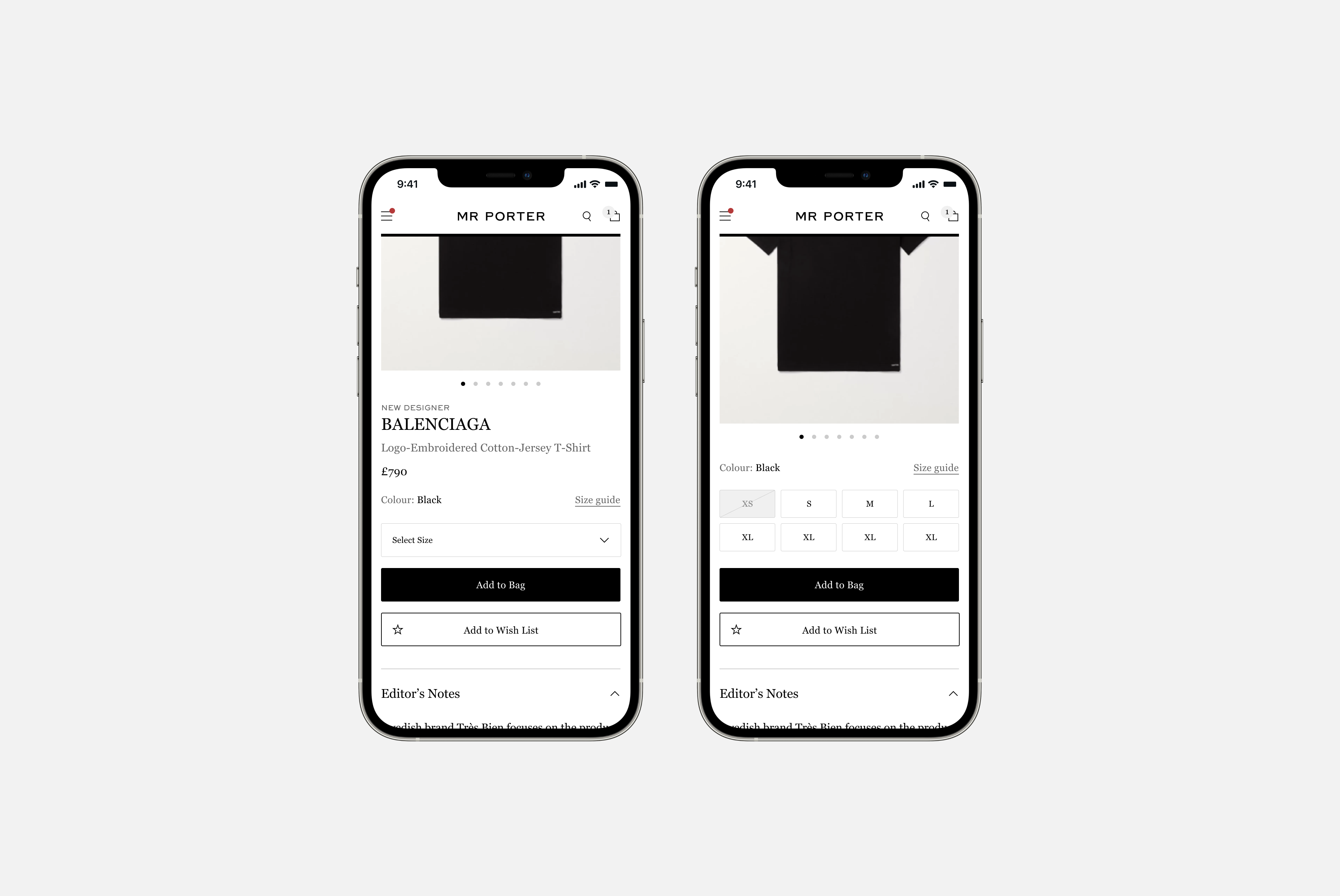
Replacing the size dropdown with a size grid. Surfacing available sizes at a glance and removes a significant customer pain point: landing on a PDP only to discover the product isn't available in your size.
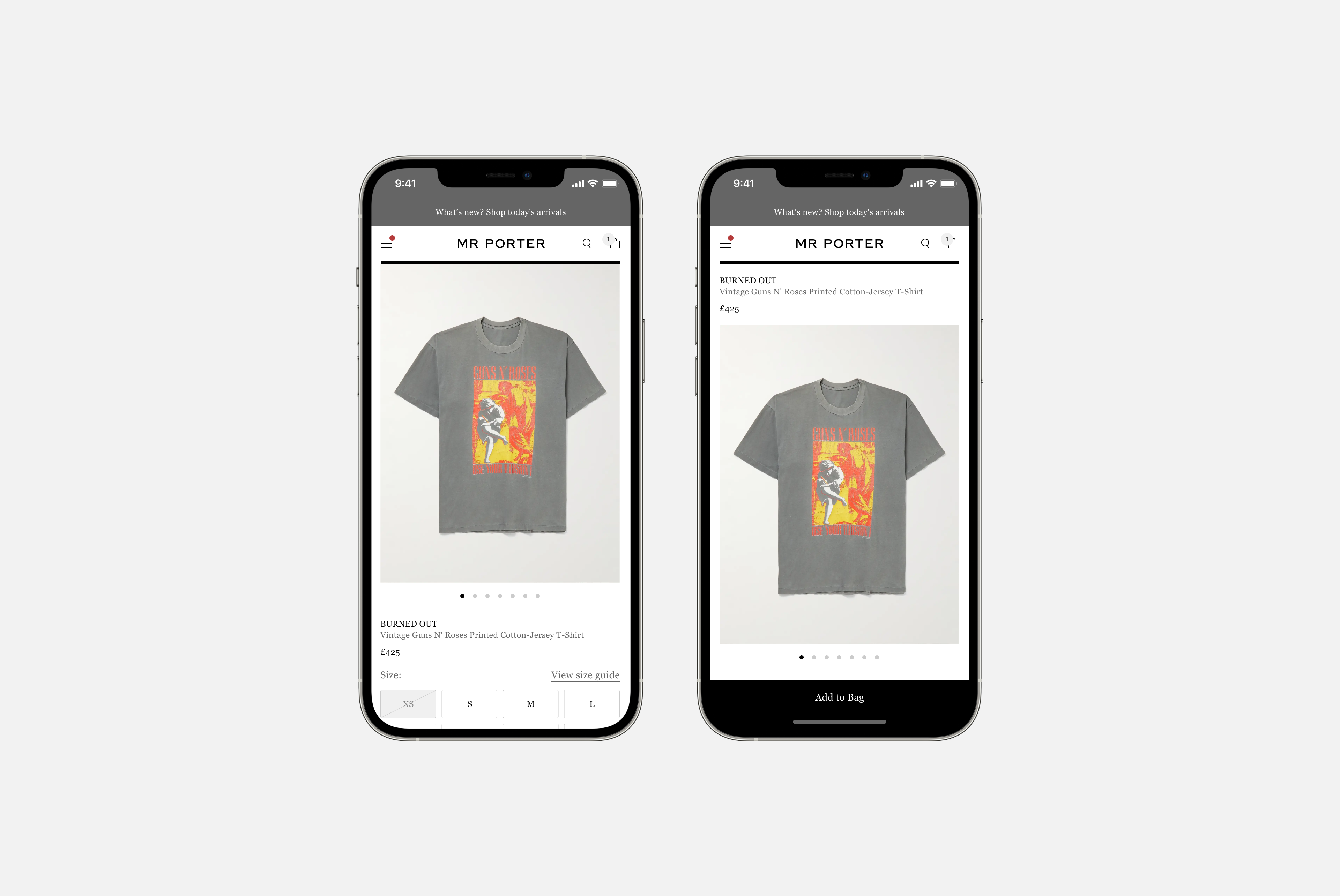
A sticky add-to-bag button paired with a layout adjustment to the product description, designed to improve conversion through a more prominent CTA.
Optimisation sits at the heart of understanding how well our UI components perform, and how effectively elements work together in context.
Taking the size grid further: PLP optimisation
The success of the size grid surfaced a wider opportunity: could we enable customers to shop directly from the PLP, reducing bounce rate before they ever reached the PDP?
The final design resolved both problems. Typographic refinements created a clear visual distinction between product information and interactive elements. Size labels update on hover to show stock levels, creating a sense of urgency. When a product is added to the bag, feedback is immediate, alongside a prompt to continue to checkout.