HIVE Design System
Building a shared design system for two of fashion's most recognised digital destinations.
The Foundation: Tooling & Ways of Working
Design systems look different everywhere. Maturity levels vary, business constraints vary, and the gap between what a design system claims to be and how designers actually use it is often wider than anyone admits.
At YNAP, Sketch files were synced across the product design team using Google Backup & Sync. The problems were predictable: files were slow to update, crashed regularly, and no one could be confident they were working from the latest version. There were no previews, no change history, and no clear signal of what had changed between versions.
Beneath the tooling issue was a quieter problem. Designers weren't fully confident in how the design system worked, but few were willing to say so. The evidence was visible in the files: symbols were routinely being detached rather than used correctly, creating compounding design and technical debt across teams in London and Bologna who had little shared infrastructure between them.
Consolidating the Toolstack
One of my first moves was working with the software asset manager to build a business case for tooling consolidation. The goal was to replace a fragmented stack (Sketch, Invision, Zeplin, Principle, and Frontify) with a single platform. Figma was the right choice: collaborative by default, browser-based, and built for the kind of distributed, multi-brand team we were operating.
The business case was straightforward once the numbers were in. Consolidating to Figma saved $61K in annual subscription costs.
Building the System
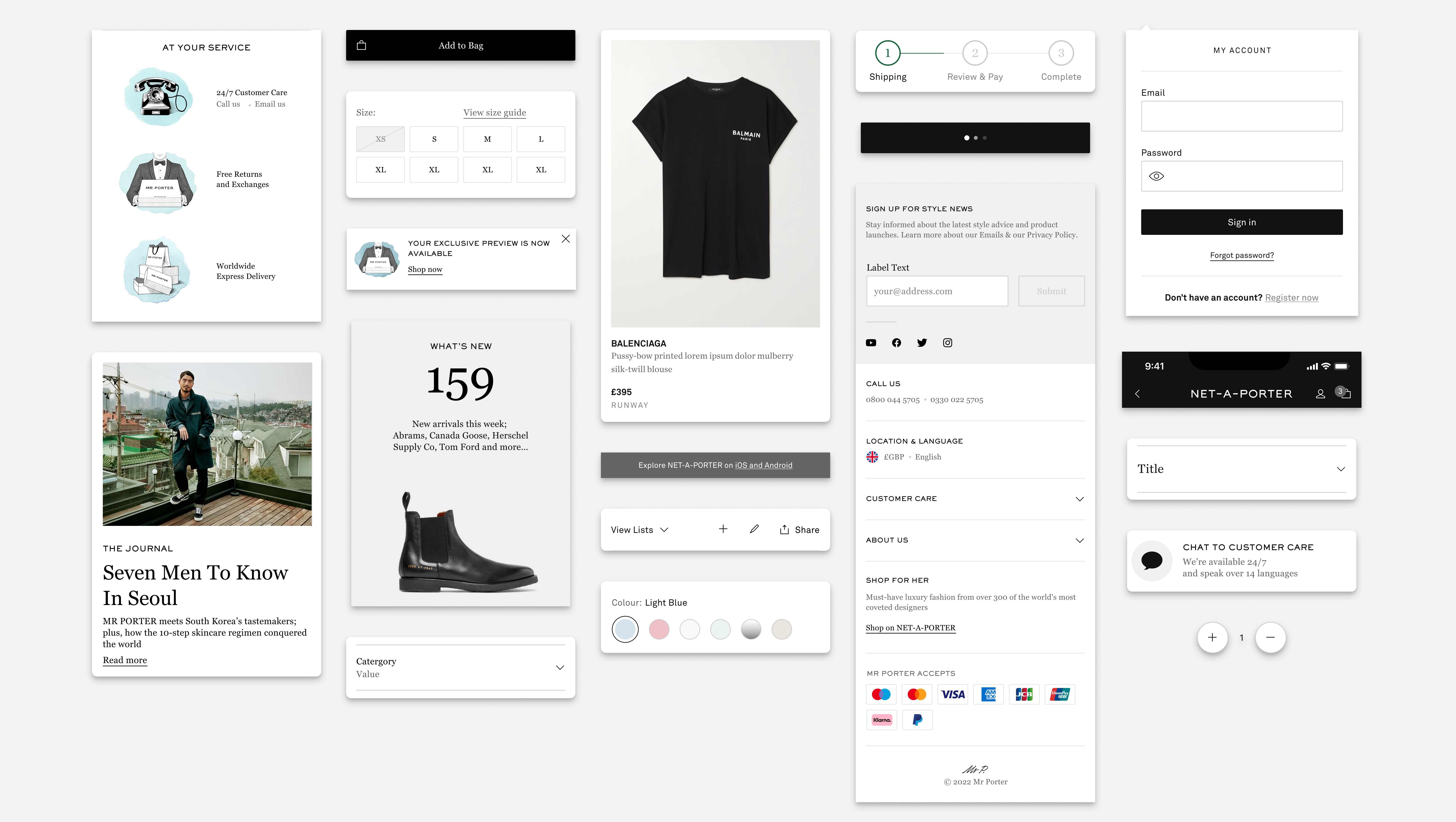
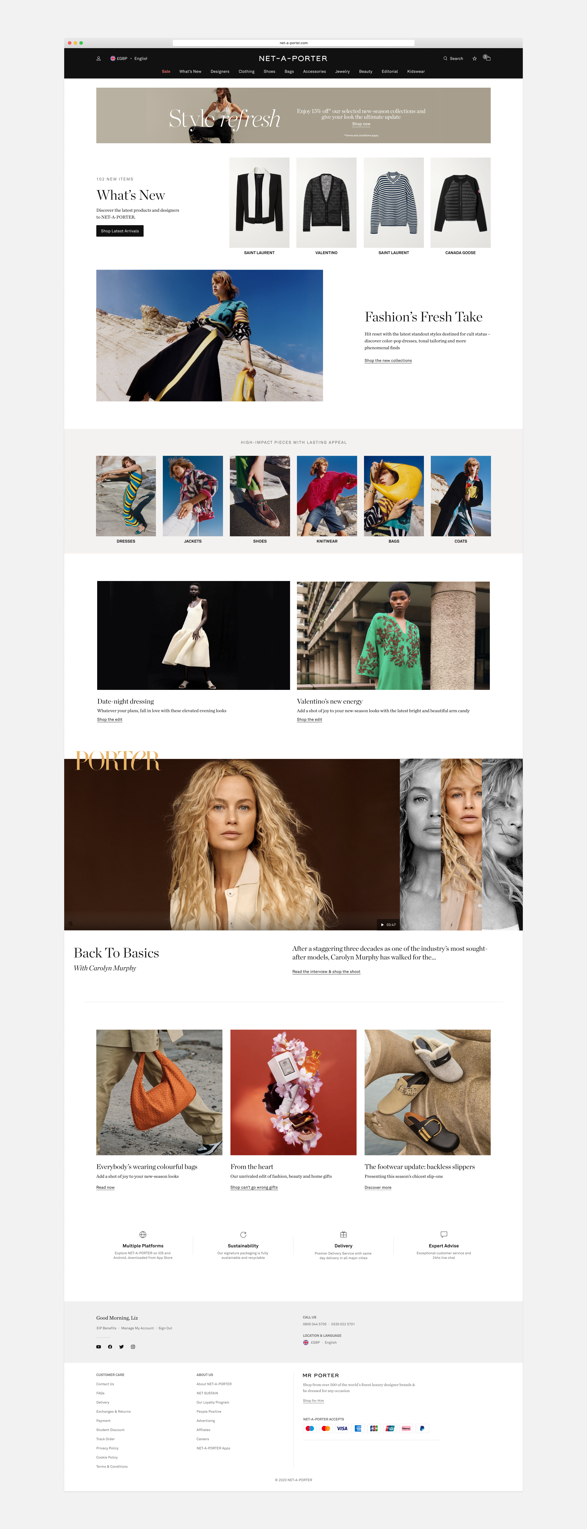
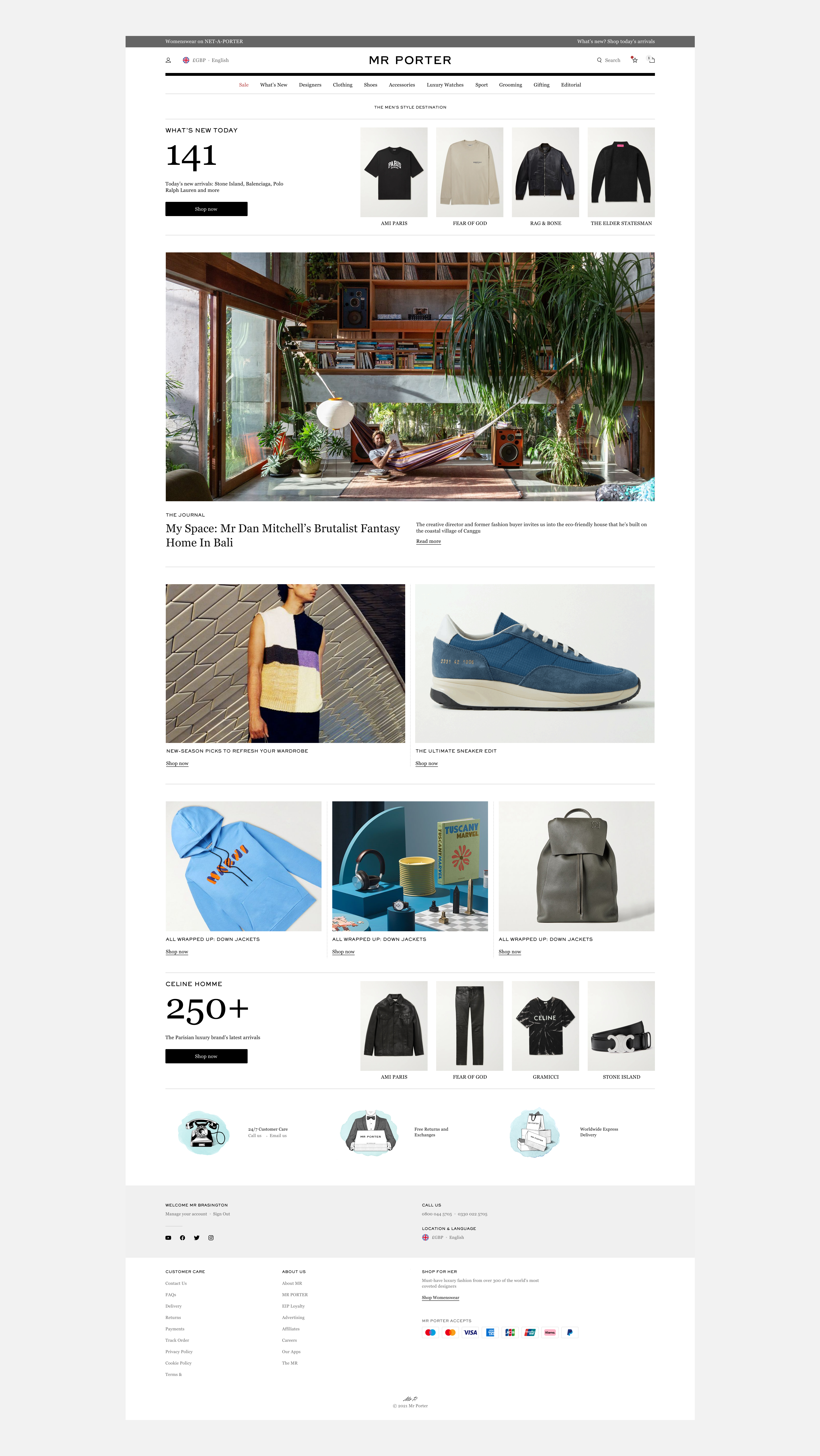
YNAP had recently relaunched MR PORTER, and NET-A-PORTER was moving onto the same platform, which gave us a clear foundation to work from. Using design tokens for colour, typography, and spacing (on an 8pt grid), we created distinct brand identities within a shared system. For NET-A-PORTER, that meant a restrained palette anchored by matte black (#111), a direct reference to the brand's packaging.
The business case was straightforward once the numbers were in. Consolidating to Figma saved $61K in annual subscription costs.
With a small, focused team of product designers, we built out the component library methodically, simplifying wherever we could. As much as the work was about components, it was equally about culture. Creating a safe space for designers to ask questions and contribute openly was the goal. A design system only works when the people using it feel they own it and feel invested enough to protect it.
Consistency extended into how we worked with engineering. We aligned on naming conventions, established a shared language between design and tech, and used Storybook to give teams live component previews, so engineers could verify they were building to spec.