John Lewis & Partners rebrand
Helping one of Britain's most loved brands find its new identity.
TL;DR
John Lewis hadn't redesigned in 18 years. I led the digital side of a full brand overhaul in collaboration with Pentagram, translating a new identity into a design system across web, iOS, and Android.
Initial ideas and early concepts
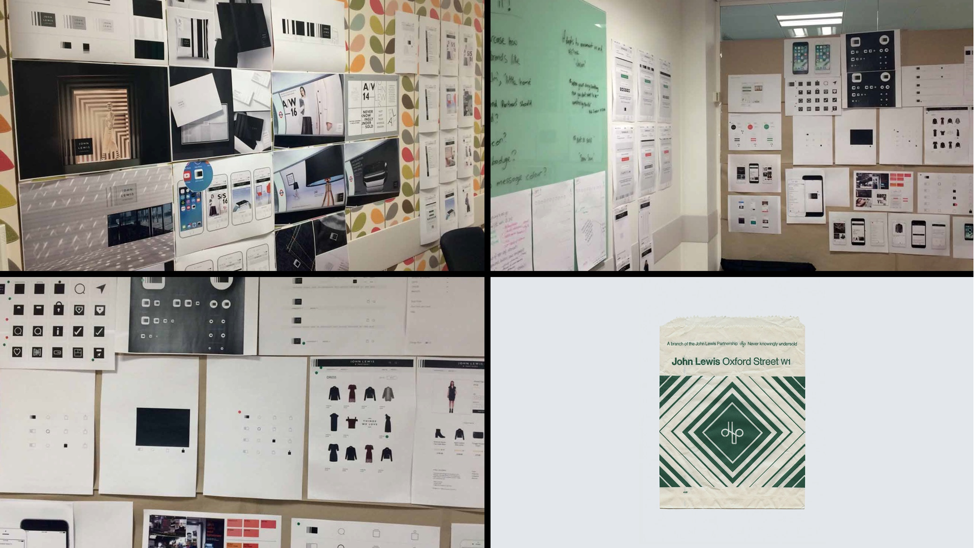
To kick off the project, I partnered with the Branding Designers at Pentagram for a week-long design spike. Together we explored the full range of brand expression: header treatments, typographic rules, color usage, iconography, and page layouts, constantly looking for opportunities to push the brand somewhere fresh and impactful.
One significant internal tension was the reluctance to move away from the green primary CTA. The business held a strong belief it was driving conversion, so any change felt risky. To build confidence across this and other key decisions, we ran customer testing, A/B tests, and eye-tracking studies to ground the work in evidence rather than opinion.
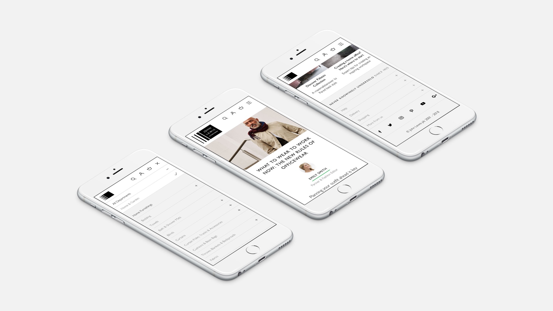
Shifting to a neutral monochrome palette solved a practical problem: it prevented products from competing visually with the UI. But it also gave the brand something harder to engineer: an aspirational quality commonly associated with premium labels like Chanel and Burberry.
Homepage
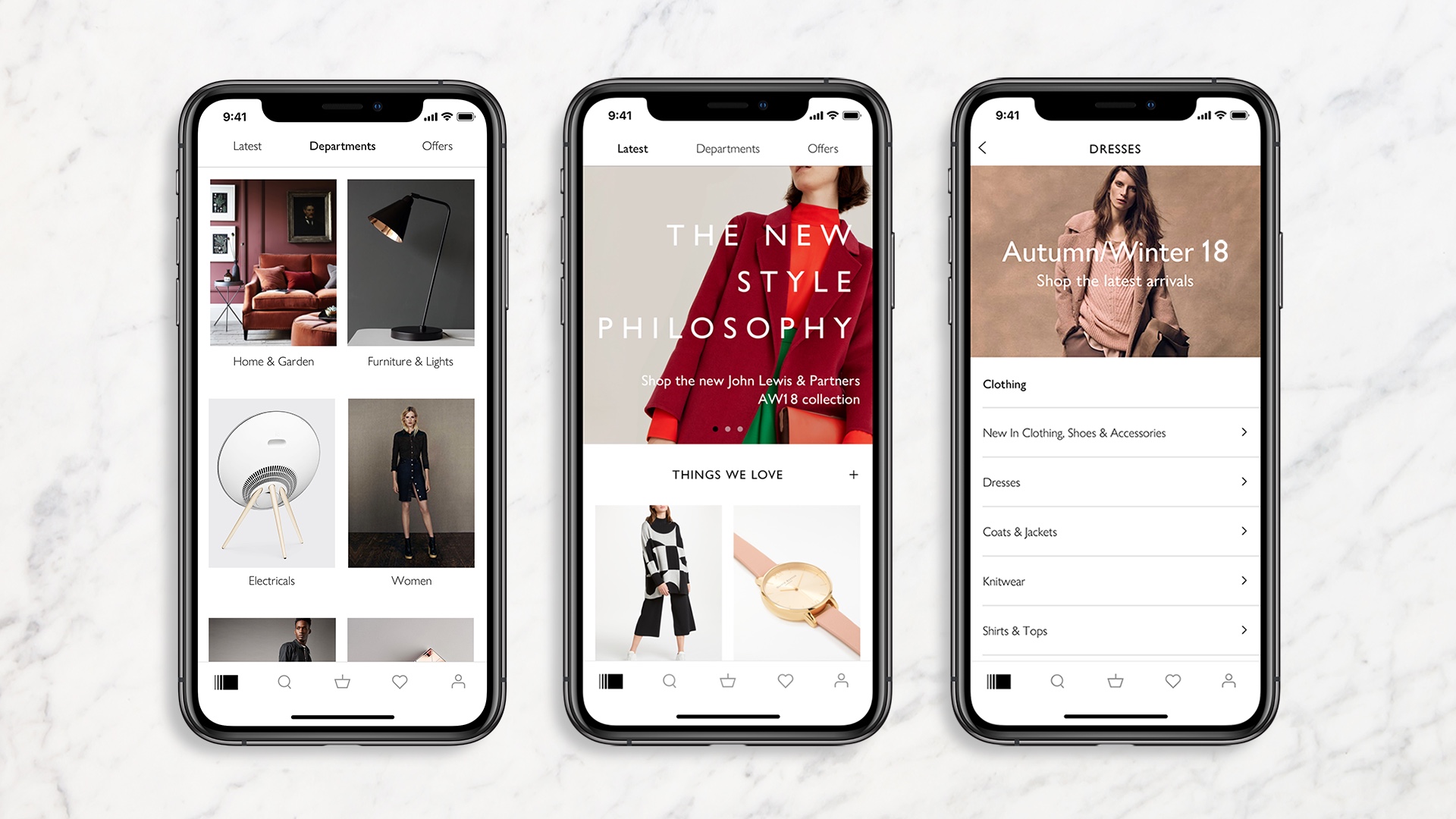
Almost every area of the digital experience was up for review. The homepage stood out. Page metrics made it clear the content wasn't working hard enough.
We collated content into thematic groups and introduced an animated type treatment to create a strong focal point, drawing users in and encouraging scroll behaviour.
Header prototype
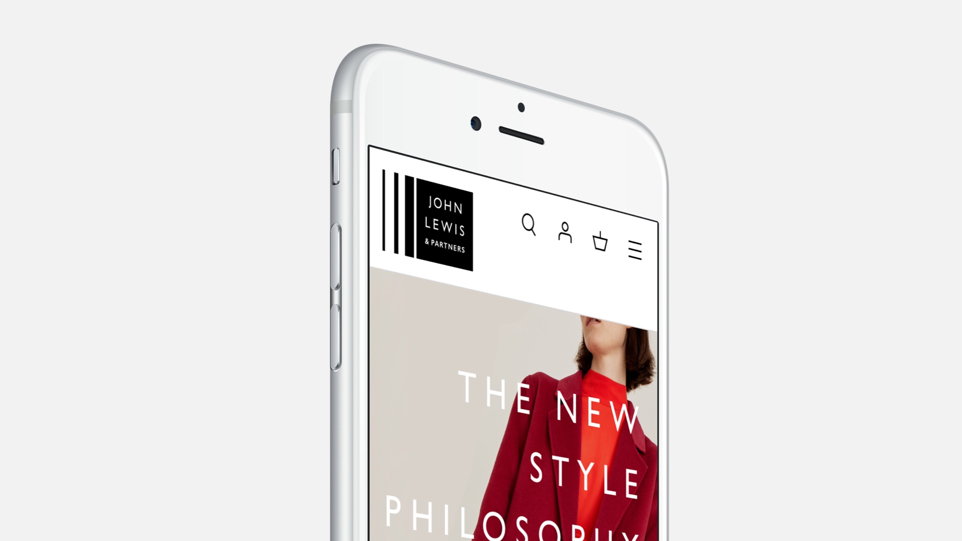
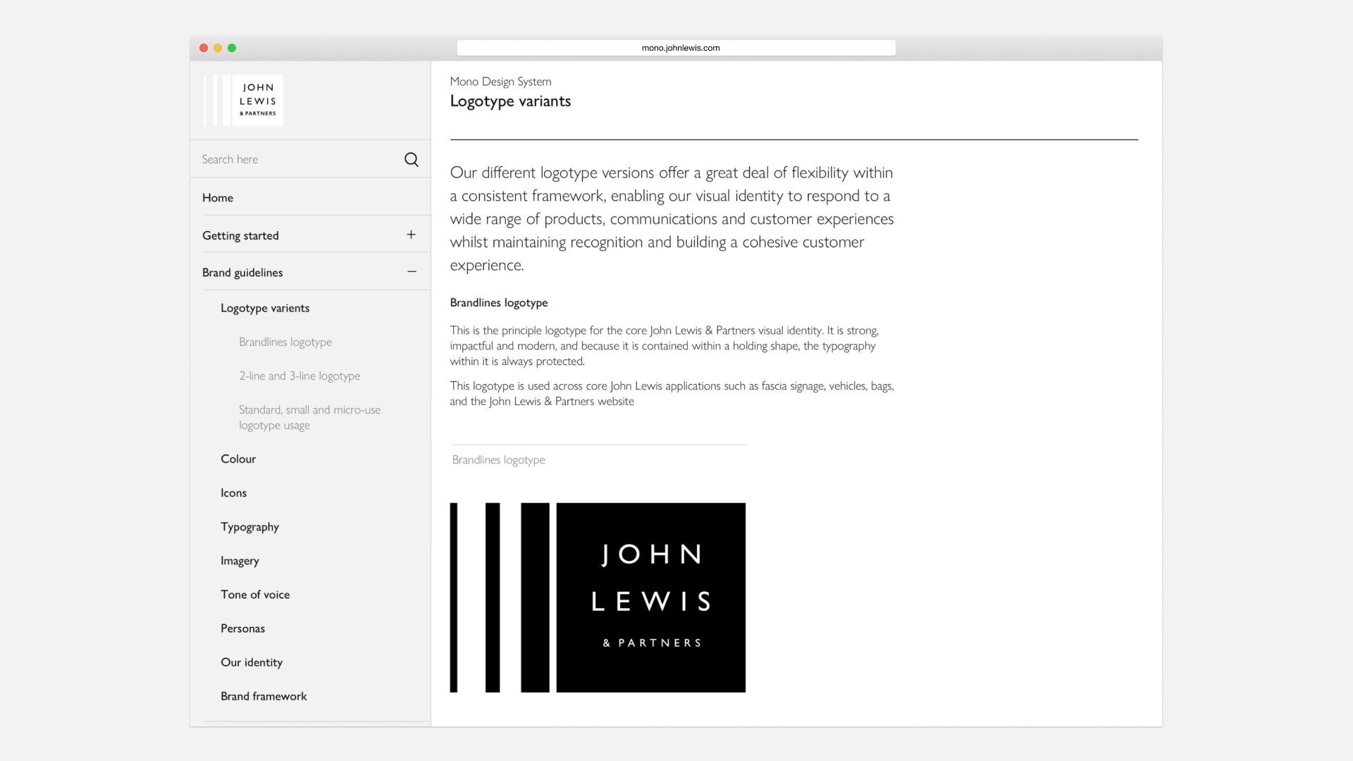
The logo you see in the header is the one we shipped, chosen over several alternatives for its dynamism and its historical resonance as a pattern used in the brand's 1960s archive. The real challenge, though, was making it work online. At full size it dominated the header and consumed too much space.
The animation was something of a eureka moment. Collapsing the logo on scroll solved the space problem while adding a small moment of delight, and it ended up setting a precedent informing how the logo was used across the wider experience, both online and offline.
It's worth noting that working with world-class branding designers doesn't always mean digital best practice comes naturally. The early drafts on the left show just how far the thinking had to travel.
The energy across the business was electric. People were genuinely proud of what they'd built together. That kind of momentum is rare, and if I could have bottled it, I would have.
Delivery approach
At the start of 2017, the project moved into delivery. My first task was onboarding 14 product teams. Many colleagues had assumed I'd been quietly working on the Christmas campaign, so the reveal came as quite a surprise.
There was genuine excitement, but also resistance. Change at this scale rarely lands without friction, and many of the harder conversations were worked through in breakout sessions, digging into the detail, unpacking the rationale, and bringing teams along rather than presenting to them.
With direction established, my design team took over the detailed execution. My role shifted to Design Consultant, supporting teams with design direction, brand toolkit onboarding, and helping set design priorities as the work fanned out across the business.
On the technical side, we took a phased approach, implementing parts of the new design that didn't expose the full rebrand. This let us demonstrate that conversion wasn't being harmed, easing the business away from a big bang launch that carried considerable risk. It also gave us a meaningful head start when the time came to go all in.
In the months leading up to the September 2018 launch, the hours were long and the pressure was real.
On launch night I stayed at the office to oversee design QA, watching everything come together as the rebrand went live at around 2am.
What followed was something harder to plan for. The energy across the business was electric. People were genuinely proud of what they'd built together. That kind of momentum is rare, and if I could have bottled it, I would have.
That said, the period after launch brought its own challenges. The momentum that had carried us through gradually faded. What felt like a springboard began to feel like a treadmill. I found myself constantly catching elements of the experience that had drifted from the new direction, and slowly I became the design police rather than a design leader.
The lesson was clear: we had no post-launch strategy, and in hindsight that was as important as anything that came before it.
My final piece of work before leaving John Lewis was the creation of their Design System which helped address that problem, at least in part.